
Brief
Re-design a logo and private label for an existing sunless tanning solution being sold on an e-commerce sunless tanning site.
Scope
Branding / Logo Design / Illustration
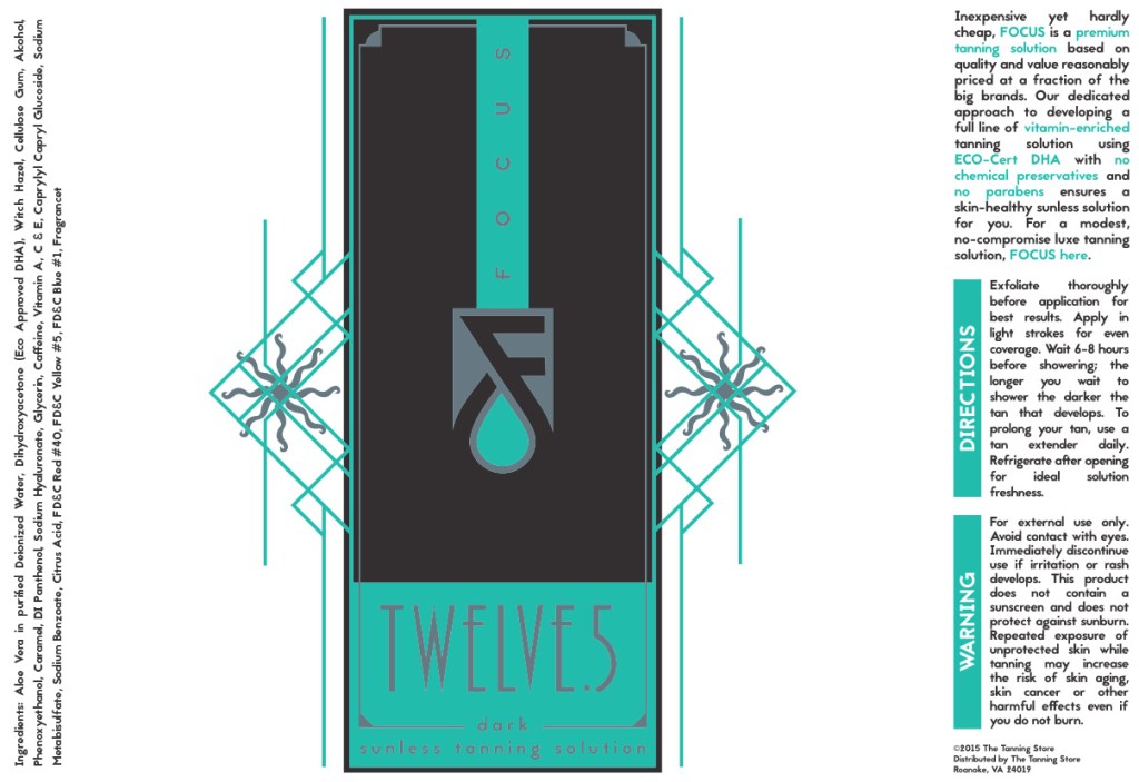
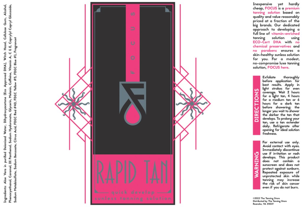
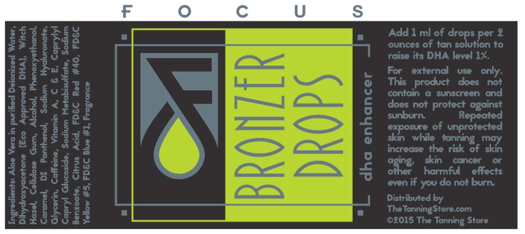
Another competitor in a completely saturated cosmetics industry, it was determined a complete brand re-design was in order.
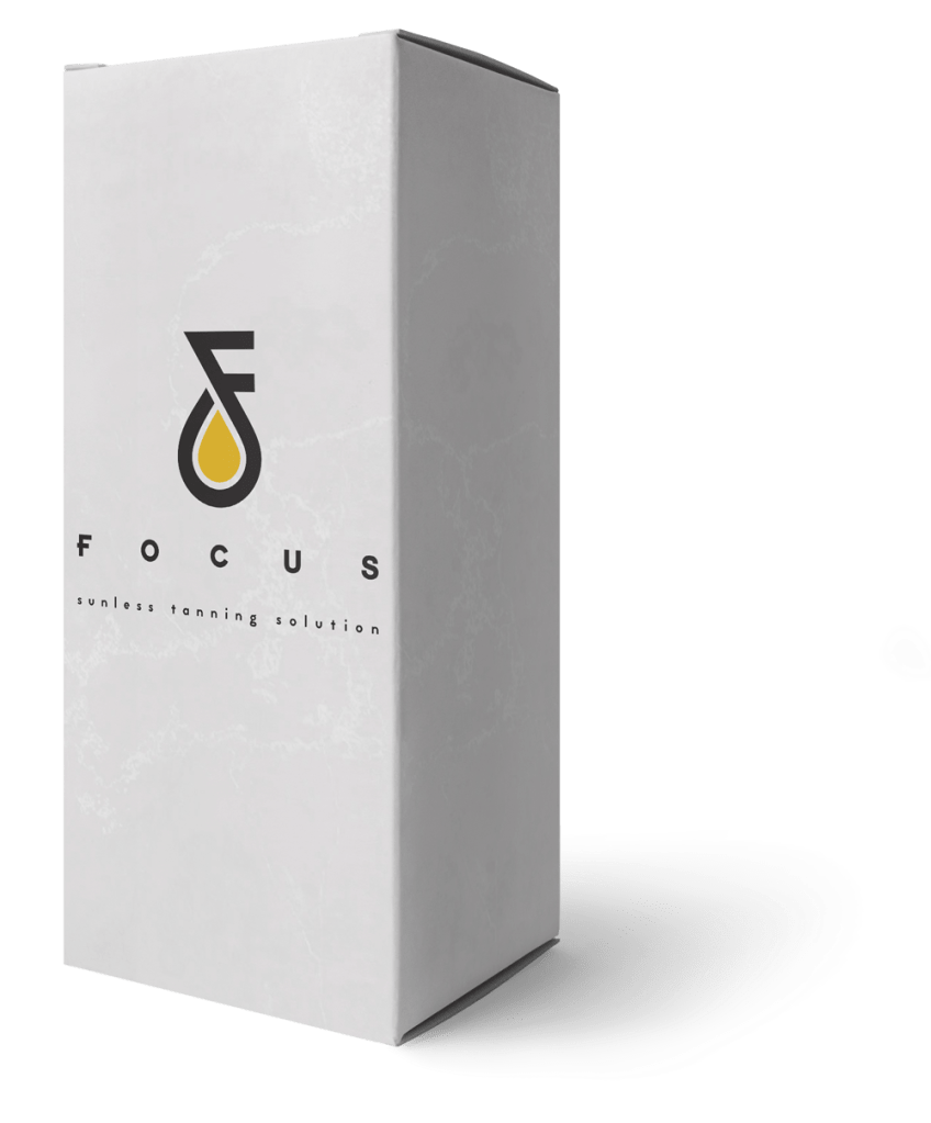
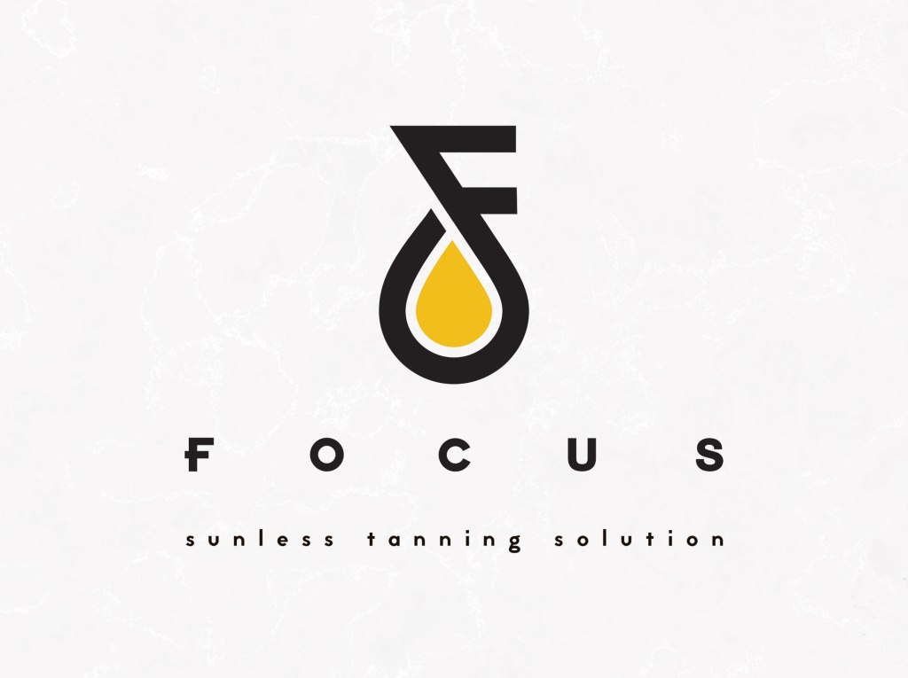
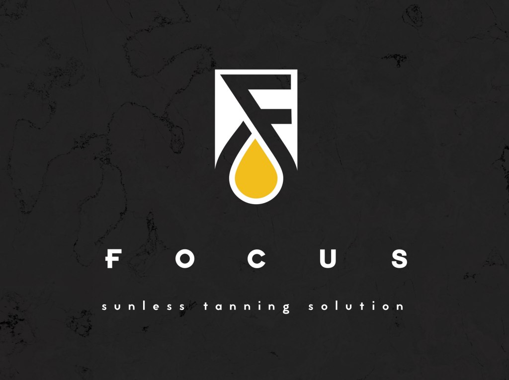
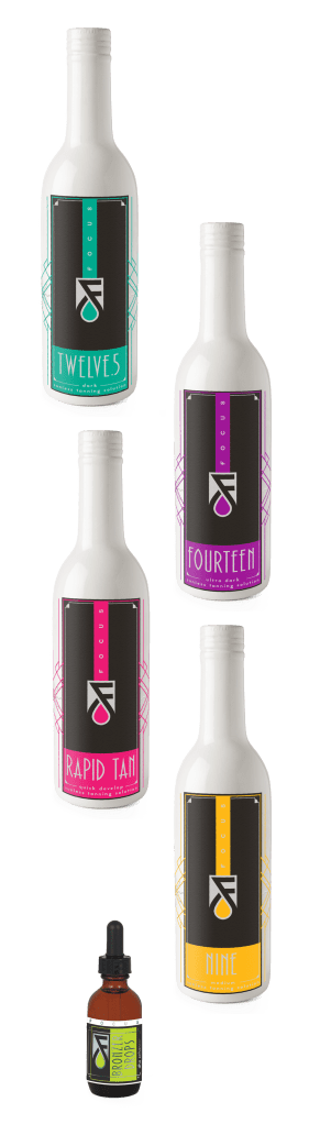
A sleek, simplistic design indicative of the largest cosmetic brands, the logo was stripped to absolutely minimal visuals. Color was kept as an important element, used as an easy way to distinguish the DHA percentages. This solved a noted problem with customers ordering the wrong solution because mistaken identity with repetitive design.

You must be logged in to post a comment.